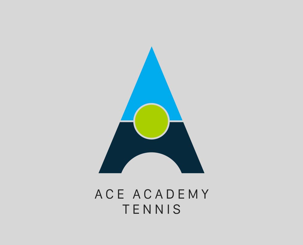
Ace Academy Tennis
Case Study: Crafting the Identity for Ace Academy Tennis – Inspiring a Love for Tennis in Sydney’s Youngest Players
Ace Academy Tennis, a Sydney-based before-school tennis program for primary school children, approached KianDesignCo with a vision: to create a brand identity that reflected their mission to introduce tennis as a fun, educational, and engaging activity for kids. The challenge was to develop a visual identity that would resonate with children, parents, and schools alike while embodying the dynamic, inclusive, and energetic spirit of Ace Academy Tennis.
This is how KianDesignCo crafted a vibrant and memorable brand identity for Ace Academy Tennis, helping them stand out in a competitive landscape.
Ace Academy Tennis needed a brand identity that addressed several key objectives:
Appealing to Kids: The design needed to be fun, bright, and engaging for children, sparking their excitement for the sport.
Building Trust with Parents: The brand needed to feel professional and trustworthy, showcasing Ace Academy Tennis as a program parents could confidently enroll their kids in.
Aligning with Schools: The branding also had to communicate professionalism and compatibility with primary schools, as they were key partners for the program’s success.
KianDesignCo was tasked with developing a brand identity that seamlessly balanced these diverse needs while creating a unique and recognizable presence for Ace Academy Tennis.
KianDesignCo’s approach began with understanding the core values of Ace Academy Tennis: fun, growth, and community. These values formed the foundation for the creative process, which focused on designing an identity that would inspire joy, confidence, and trust.
Playful and Vibrant Logo:
The Ace Academy Tennis logo was designed to be bright and playful, featuring a stylized tennis ball icon integrated with dynamic motion lines to represent energy and movement. A friendly sans-serif typeface was chosen to create an approachable and kid-friendly aesthetic.
Color Palette:
The color palette featured bold and cheerful hues, including shades of green, blue, and orange. These colors symbolized growth, vitality, and energy, making the brand feel lively and approachable for kids while maintaining a professional edge for parents and schools.
Typography:
A mix of modern, rounded fonts was used to ensure readability and maintain a playful tone. The typography reinforced the balance between fun and professionalism, making it suitable for promotional materials and school-related communications.
Custom Illustrations:
To further enhance the appeal to children, KianDesignCo created custom tennis-themed illustrations featuring fun characters and engaging visuals. These were incorporated into flyers, brochures, and digital assets to make the program feel accessible and exciting.
Comprehensive Brand Assets:
The branding extended to a full suite of assets, including uniforms, banners, signage, social media templates, and enrollment forms. This ensured consistency across all touchpoints and reinforced the professionalism of the program.
The new branding for Ace Academy Tennis successfully captured the fun, energetic spirit of the program while building trust with parents and aligning with schools. The vibrant visuals immediately resonated with children, making the program more appealing to young players.
Parents responded positively to the professionalism of the branding, which gave them confidence in the program’s quality and safety. Meanwhile, the alignment with schools helped Ace Academy Tennis secure more partnerships, allowing the program to expand its reach across Sydney.
The branding also translated seamlessly across both print and digital platforms, with social media campaigns and promotional materials helping to drive awareness and enrollment.
“We couldn’t be happier with the branding KianDesignCo created for Ace Academy Tennis. They perfectly captured the energy and fun of our program while making it feel professional and trustworthy. The response from kids, parents, and schools has been overwhelmingly positive, and we’ve seen a significant increase in interest and enrollment. It’s a brand we’re truly proud of.”
KianDesignCo’s work with Ace Academy Tennis demonstrates the power of thoughtful branding in connecting with diverse audiences. By creating a fun yet professional identity, they helped Ace Academy Tennis position itself as a leader in before-school sports programs, inspiring a love for tennis among Sydney’s youngest players.
For organizations looking to make a lasting impact, KianDesignCo’s work with Ace Academy Tennis is a shining example of how strategic design can elevate a brand and fuel growth.
