Bridgeworks
KianDesignCo’s Branding for Bridgeworks – Building a Strong Identity for a Leading Civil Engineering Firm
Bridgeworks is a premier civil engineering and bridge construction company that specialises in designing and building infrastructure solutions. Known for their expertise, precision, and reliability, Bridgeworks handles complex projects, including large-scale bridge constructions, infrastructure rehabilitation, and urban planning initiatives. They are dedicated to delivering high-quality structures that are built to last and designed to elevate the communities they serve. However, as the company grew, they needed a brand identity that would reflect their leadership and innovation in the industry. That’s where KianDesignCo stepped in.
KianDesignCo started by conducting in-depth research to understand the engineering and construction industry and identify what sets Bridgeworks apart. Through interviews with Bridgeworks’ leadership team and research on industry trends, KianDesignCo uncovered key insights: Bridgeworks’ core values of strength, precision, and innovation, along with their commitment to community and sustainability, were defining aspects of the brand. These values became the foundation for the branding approach.
With these insights, KianDesignCo explored visual and thematic concepts that would best represent Bridgeworks’ identity. The team presented a series of concepts based on ideas of strength, structure, and stability—qualities synonymous with bridge building and engineering. The concepts included design elements inspired by bridge architecture, such as lines and geometric shapes, as well as colour schemes that convey trust, stability, and professionalism.
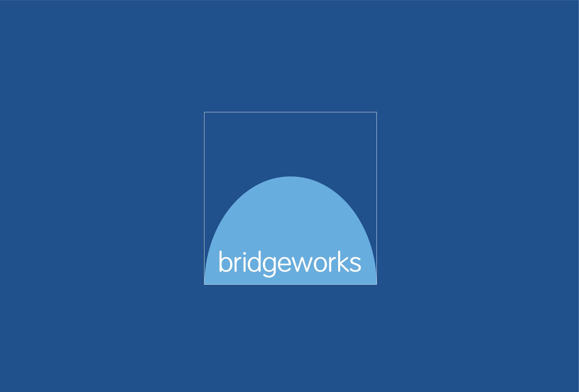
The new logo was designed to be both modern and timeless, representing the solid foundations upon which Bridgeworks builds its projects. The final logo features a stylised bridge icon that combines clean, bold lines to convey strength and simplicity. The design incorporates geometric shapes that subtly reference the structures Bridgeworks constructs, with a minimalist approach that makes it versatile and impactful. The choice of a deep blue colour symbolises trust and reliability, while subtle grey accents add a sense of professionalism and sophistication.
KianDesignCo chose a colour palette of deep blue, steel grey, and muted green, a combination that reflects both the corporate professionalism and the natural elements involved in civil engineering. Deep blue and gray convey strength, stability, and reliability, while muted green adds a touch of approachability and underscores Bridgeworks’ commitment to sustainable practices.
The typography was selected to ensure readability and convey strength. A clean, modern sans-serif typeface was used as the primary font, giving the brand a contemporary look that’s easy to apply across multiple mediums. This typeface was chosen for its readability and scalability, ensuring the brand looks clear and professional whether on large billboards or digital platforms.
KianDesignCo developed a visual language that reinforces the themes of engineering and precision. Iconography inspired by engineering blueprints was incorporated into the brand assets, creating a subtle, recognisable visual cue that connects Bridgeworks’ branding with the work they do. Grid patterns were used in marketing materials to symbolise structure, alignment, and planning, while photography guidelines focused on capturing large-scale projects from angles that highlight their monumental quality and technical detail.
The new branding for Bridgeworks successfully transformed the company’s image, creating a cohesive and professional identity that resonates with clients, partners, and the community. Bridgeworks now stands out in the engineering and construction industry, with a brand that reflects their reliability and expertise in a highly competitive market. The modern, sophisticated look has helped build confidence among clients and solidify Bridgeworks’ reputation as a leading civil engineering firm.
Visit Bridgeworks for more.