Case Study: Launching JetPark – A Bold New Identity for Sydney’s Smartest Airport Parking Solution
JetPark approached KianDesignCo as a new entrant in the competitive airport car park market with a clear mission: to provide a smarter, faster, and more reliable parking experience for Sydney Airport travellers. With no brand presence, collateral, or digital footprint, JetPark required a full-scale branding solution from the ground up — one that would position them as modern, trustworthy, and convenient.
Our goal? To design a bold brand that cuts through the noise of traditional parking services, appeals to tech-savvy travellers, and evokes the ease of their seamless booking and parking system.
The Strategy
We began with a collaborative brand discovery session to unpack JetPark’s vision, audience, and points of difference. The insights shaped our strategy:
Position JetPark as a tech-enabled, customer-first car park service
Emphasise efficiency and peace of mind for both business and leisure travellers
Create a flexible, future-ready identity that could grow with the business
The Brand Identity
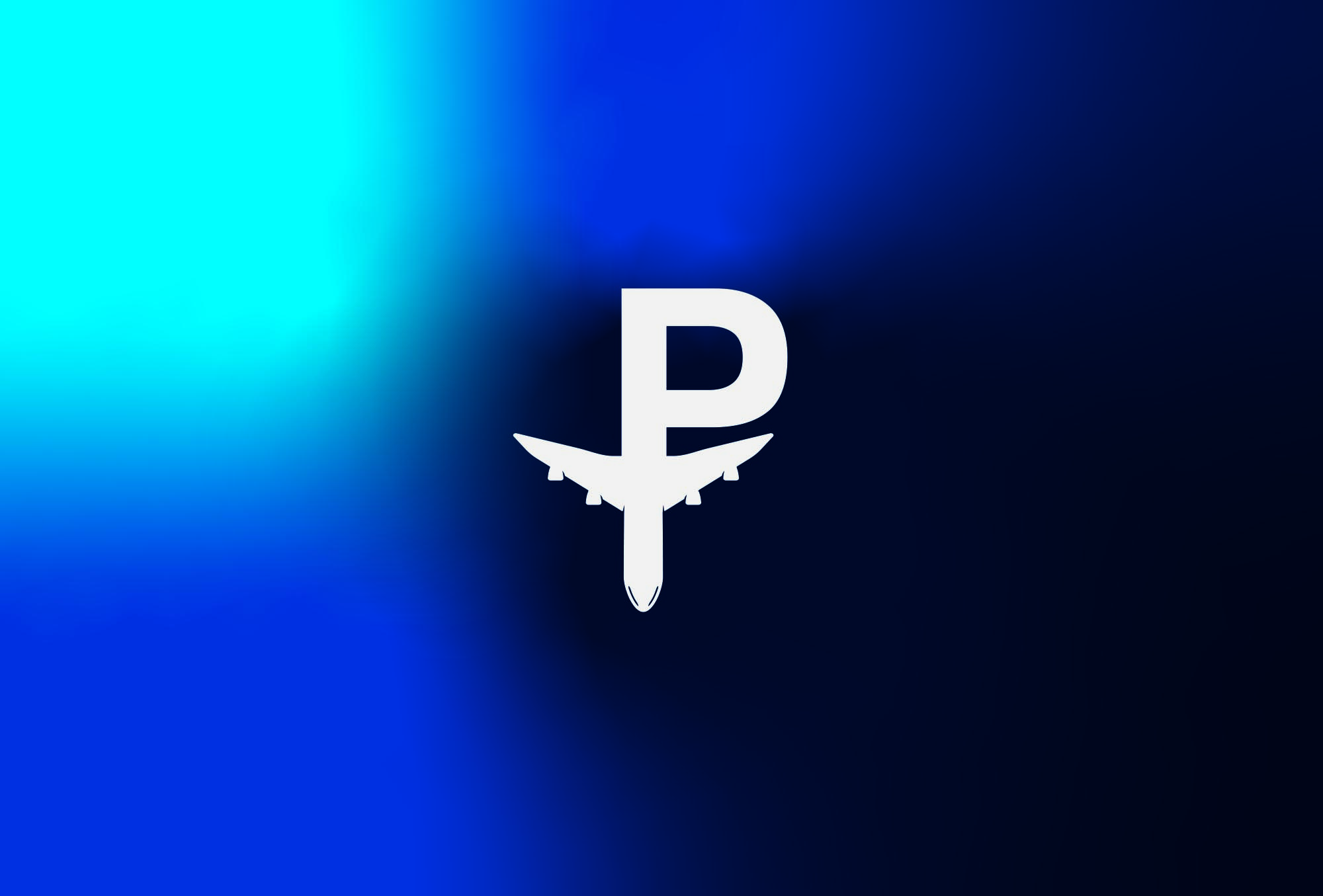
The JetPark logo strikes a balance between movement and precision. We designed a bold sans-serif wordmark with sharp custom cuts symbolising speed, direction, and reliability. A simplified runway-inspired “J” monogram is a scalable icon for app usage and digital signage. JetPark’s primary colour is Jet Blue, a rich, deep blue that communicates trust and professionalism. It’s paired with Signal Orange for a high-visibility contrast—ideal for wayfinding, calls to action, and digital interfaces.
A clean, geometric typeface system was chosen to reflect modernity and ease-of-use across print and screen. We built a modular visual system using graphic lines, motion elements, and travel-inspired iconography. These assets communicate movement, simplicity, and airport connectivity.
KianDesignCo delivered a sleek, mobile-first website UI for quick booking and real-time space availability. We built wireframes and design mockups that streamline the user journey — from pricing and directions to instant booking. The visual tone is confident, intuitive, and accessible to all travellers.
Signage & Wayfinding:
We created on-site signage and directional systems that were clean, highly legible, and on-brand, critical in high-traffic airport environments.
We developed an initial suite of launch content for social media, including animated reels, parking benefit highlights, and opening announcements to introduce JetPark across digital platforms.
JetPark launched successfully with a cohesive brand that instantly communicated professionalism, convenience, and innovation. The visual identity stood out in an otherwise dated industry space, and early user feedback praised the easy booking experience and clear, modern signage.
What JetPark Said
“KianDesignCo captured exactly what we needed — a clean, modern brand that feels trustworthy and easy to use. The feedback from customers has been overwhelmingly positive. We’re proud to have partnered with them to bring JetPark to life.” — Andrew Trovas, Sydney
Conclusion
At KianDesignCo, we love working with startups ready to make an impact. JetPark is a testament to how thoughtful design can elevate even the most practical services into memorable, customer-first experiences.