Litte L
KianDesignCo’s Branding for Little L – A Sydney-Based Chicken Restaurant
When Sydney’s Little L approached KianDesignCo, they were looking for more than just a logo—they needed a complete brand identity that would reflect their vibrant personality and delicious offerings. Little L, a boutique chicken restaurant and takeaway, wanted to stand out in Sydney’s competitive food scene with a brand that would encapsulate its culinary passion, community focus, and modern aesthetic. This is how KianDesignCo crafted a visually stunning and strategically impactful brand identity for Little L.
Little L had two primary objectives:
To differentiate itself from other fast-casual chicken restaurants with a unique and memorable brand.
To create a visual identity that would resonate with a wide demographic, from families seeking hearty meals to young foodies looking for Instagram-worthy dining experiences.
KianDesignCo needed to balance these goals while creating a brand that embodied Little L’s values—fresh, bold, and unmistakably Sydney.
KianDesignCo started by conducting in-depth research into the local dining landscape, customer behaviours, and Little L’s vision. The creative process revolved around these core principles:
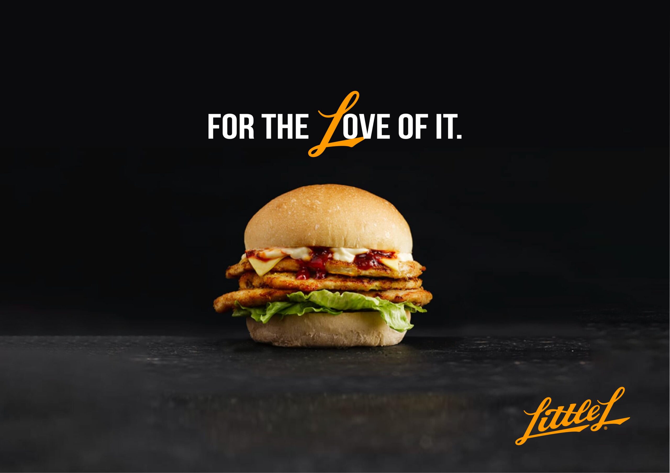
Fresh and Bold Aesthetic: A vibrant colour palette was developed to echo the freshness of Little L’s menu. Yellow and orange tones were chosen as key brand colours, symbolizing warmth, energy, and the golden perfection of their signature dishes.
Playful and Modern Typography: The custom typography for the logo and accompanying assets was designed to be bold and approachable. A mix of rounded, playful letterforms and clean, modern lines captured the balance between family-friendly and cutting-edge.
Visual Storytelling: Recognizing the importance of visual storytelling in today’s social media-driven world, KianDesignCo incorporated a series of playful chicken illustrations and patterns into the branding. These elements were used across packaging, signage, and marketing materials to create a cohesive and engaging visual identity.
Functional Design for Every Touchpoint: Every element was crafted to ensure brand consistency while enhancing the customer experience from menu designs and takeaway packaging to signage and uniforms.
The new branding for Little L was an immediate hit, both with customers and on social media. The vibrant colour palette and quirky chicken illustrations quickly became a recognizable hallmark of the restaurant, helping Little L stand out in Sydney’s crowded food scene.
The playful yet professional design also gave Little L a strong platform for future growth, allowing them to expand their presence while maintaining a cohesive brand identity. Customers frequently commented on the quality of the packaging and the memorable design, helping to reinforce their loyalty to the brand.
“Working with KianDesignCo was a game-changer for Little L. They truly understood and brought our vision to life in a way we never imagined. From the logo to the packaging, every detail feels like an extension of who we are as a business. Our customers love the new look, and we’re so proud to show off our brand!”
The Little L project exemplifies how thoughtful, creative branding can transform a business. By blending strategy, design, and storytelling, KianDesignCo gave Little L a unique identity that resonates with its target audience and sets it apart from the competition.
For businesses looking to create a lasting impact with their brand, KianDesignCo’s work with Little L is a testament to the power of design in driving success.
Visit Little-L for more.