Marconi Stallions FC
KianDesignCo’s Bold Rebranding of Marconi Stallions Football Club Sydney: A Case Study in Modern Football Design
In the dynamic world of sports branding, few projects require the balance of tradition and modern appeal quite like a football club rebranding. The Marconi Stallions Football Club in Sydney, a name synonymous with Australian soccer for decades, recently underwent an exciting rebranding spearheaded by the creative minds at KianDesignCo. This reimagining of the Stallions’ visual identity is a compelling example of how a modern brand refresh can honour a club’s rich heritage while attracting a new generation of fans. Let’s take a closer look at the concept, the design elements, and the strategic approach behind this noteworthy transformation.
Established in 1956 by Italian immigrants in Sydney, the Marconi Stallions Football Club has long been a staple of Australia’s football scene. Named after Guglielmo Marconi, the famous inventor, the club has a proud history and a passionate fan base. However, with shifting demographics, new competition, and changing aesthetics in sports branding, the Stallions’ former identity was due for a refresh. KianDesignCo was tasked with bringing new life to the club’s image, reflecting both its past and its ambitions for the future.
KianDesignCo approached the Marconi Stallions rebranding project with a comprehensive strategy focused on three main pillars: tradition, modernity, and connection. The challenge was to craft a brand identity that felt both timeless and contemporary—something that long-time supporters could rally behind while also appealing to younger fans.
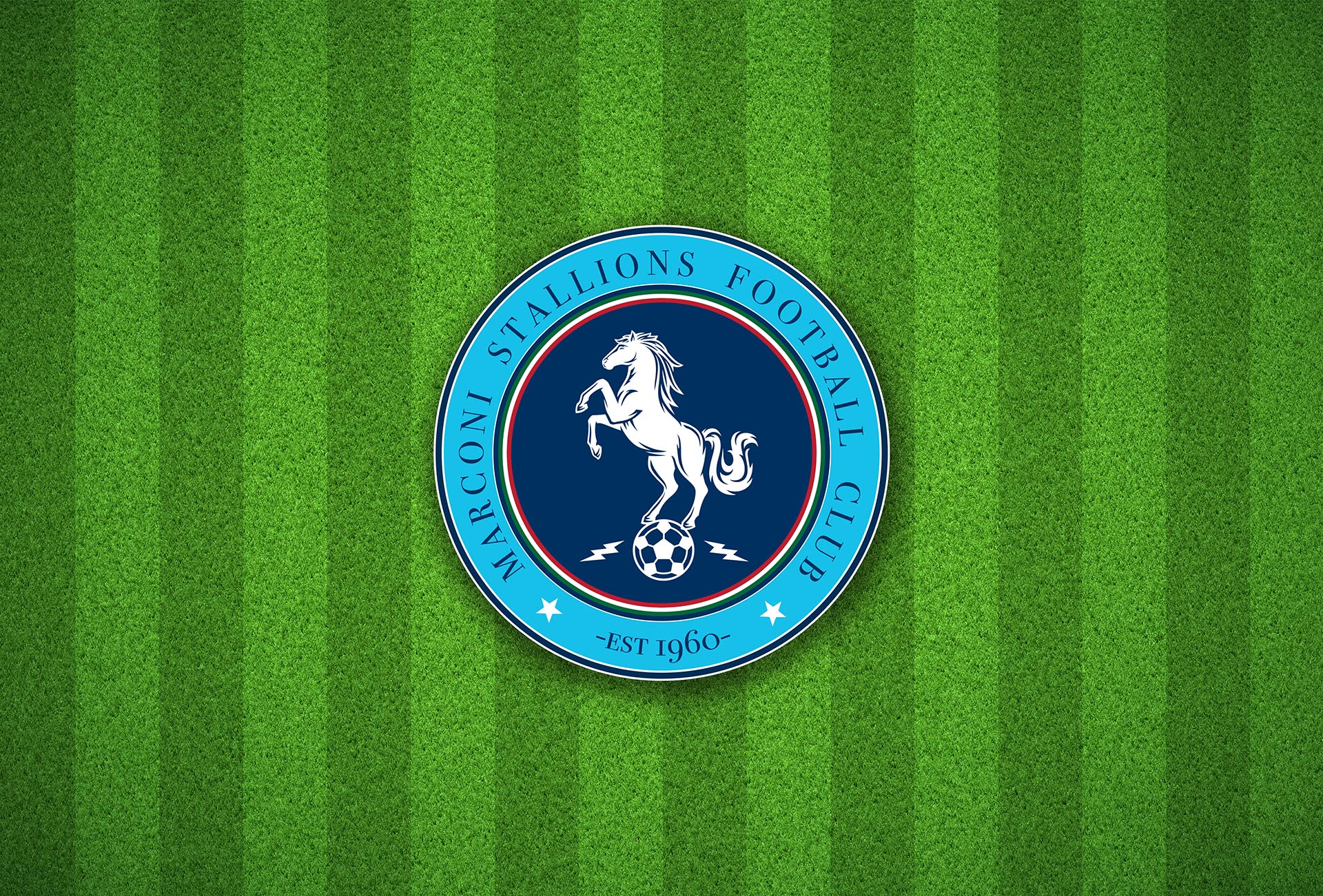
The Stallions’ Italian heritage and rich history in Australian football are integral to the club’s identity, so it was vital for KianDesignCo to weave these elements into the new design. They retained core symbols such as the stallion, a strong and dynamic representation of strength, resilience, and endurance, and incorporated new Italian-inspired flourishes with modern touches.
The updated stallion logo features more streamlined and defined lines, reflecting the modern sports logo aesthetic. The design still exudes power and athleticism but in a way that feels current and progressive. By refining the stallion icon, KianDesignCo maintained a visual link to the past while making it more adaptable across digital and physical platforms.
A defining trend in contemporary sports branding is a shift toward cleaner, more versatile designs that look sharp in digital media and on physical merchandise. KianDesignCo adopted this approach by simplifying the Stallions’ color palette, favouring bold blacks, whites, and Italian flag-inspired accents of red, white, and green.
The typography was also updated to a sleek, sans-serif font that is visually clear and easy to read across platforms, from social media graphics to stadium signage. The typeface carries an assertive yet approachable tone, embodying the competitive spirit of the Stallions while appealing to the next generation of fans.
One of the key goals of the rebranding was to deepen the Stallions’ connection with their community. To achieve this, KianDesignCo designed a series of versatile brand assets that the club could use to engage with fans both on and off the field. Social media graphics, fan merchandise, and match-day materials now sport the club’s refined logo and branding elements, making every interaction a cohesive experience.
Furthermore, the club’s rebranding was designed with customisation in mind, enabling local fans, businesses, and even the club’s youth leagues to incorporate elements of the Stallions’ new visual identity into their own materials. This focus on adaptability and local involvement aims to foster a strong sense of pride and unity among the Marconi Stallions’ fan base.
The rebranding has already started to gain positive traction among fans and the broader football community. Longtime supporters appreciate the homage to the club’s Italian roots, while new fans are drawn to the bold, contemporary design. Marconi Stallions’ social media channels have experienced increased engagement, and early merchandise sales indicate a favourable reception. Fans, young and old, have expressed a renewed pride in their club, signalling that KianDesignCo successfully struck the balance between tradition and modernity.
The success of this rebranding effort can be attributed to KianDesignCo’s deep understanding of both the club’s legacy and the evolving tastes of today’s football audiences. Here are a few reasons why this rebranding resonates:
1. Authenticity – The Stallions’ heritage wasn’t sidelined in the rebranding; instead, it was celebrated in a way that feels authentic and sincere.
2. Versatility – The new design is versatile, ensuring it looks as compelling on a smartphone screen as it does on a match-day banner.
3. Community-Focused– The emphasis on community engagement ensures that the Stallions remain a beloved symbol for fans of all ages.
KianDesignCo’s rebranding of the Marconi Stallions Football Club has not only refreshed the club’s image but has also set a new standard in Australian sports branding. By successfully merging tradition with modernity, KianDesignCo has created a timeless identity that honors the Stallions’ past and positions them for future success. This rebranding is more than a visual update; it’s a symbol of the club’s enduring commitment to its fans, community, and legacy.