Middle Yeast
KianDesignCo’s Branding Transformation for Middle Yeast – A Modern Middle Eastern Bakery & Cafe
Middle Yeast is a fresh and innovative startup franchise bringing the rich flavours of the Middle East to urban neighbourhoods, with a focus on modernising traditional Middle Eastern cuisine. From handmade pita bread to authentic pastries and aromatic coffees, Middle Yeast aims to be a go-to destination for anyone seeking an immersive cultural experience in a vibrant cafe setting. As a new entrant in the market, they approached **KianDesignCo** to develop a brand identity that could resonate with a diverse, contemporary audience while honouring the authenticity of Middle Eastern roots.
The key goals for KianDesignCo were to:
1. Create a distinct brand identity** that merges traditional Middle Eastern charm with modern, minimalistic aesthetics.
2. Appeal to a broad, multicultural audience** with a focus on young urban dwellers and food enthusiasts.
3. Develop cohesive branding elements that work across digital and physical spaces to create a memorable in-store and online experience.
4. Establish a foundation for a franchise-ready design system that can be easily adapted to new locations.
To understand Middle Yeast’s vision and unique offerings, KianDesignCo dived deep into the cultural significance of Middle Eastern design and food aesthetics. This research extended to colors, patterns, textures, and symbols that are not only iconic to the region but also carry meaning and warmth. Interviews with Middle Yeast’s founders and a study of target customer personas helped KianDesignCo define the emotional resonance and message the brand should communicate.
After the research phase, KianDesignCo presented a range of initial concepts centred around a “modern heritage” theme. This concept combined clean, contemporary lines with hints of Middle Eastern motifs, ensuring the brand felt both fresh and grounded. The core ideas were distilled into key branding pillars:
– Warmth and Hospitality: Emphasising the welcoming, communal spirit of Middle Eastern culture.
– Modern Minimalism: Achieving a sleek, approachable look that would appeal to a global audience.
– Bold Yet Authentic Color Palette: Reflecting the earthy tones and vibrant spices of Middle Eastern cuisine with hues like deep saffron, burnt orange, and olive green.
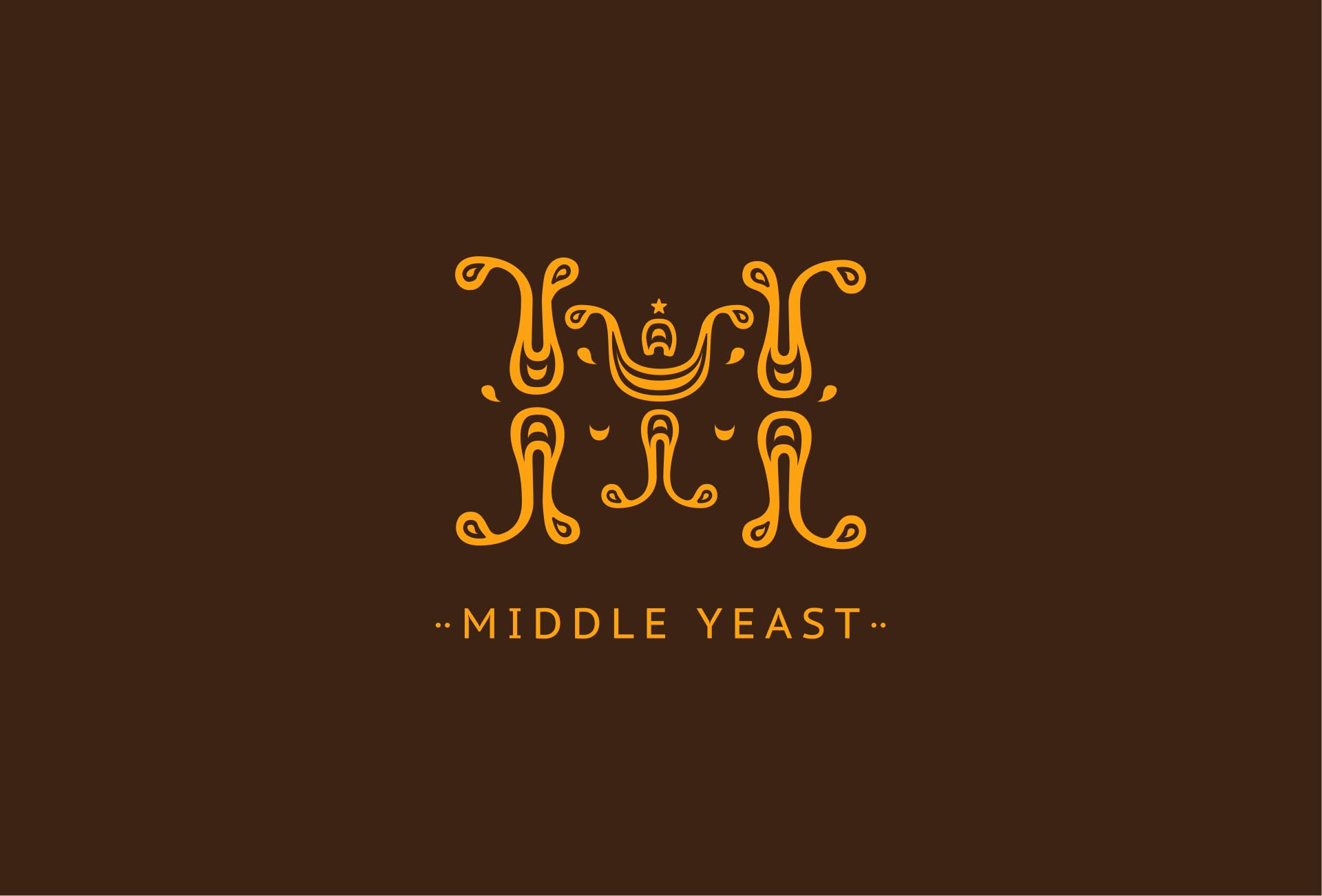
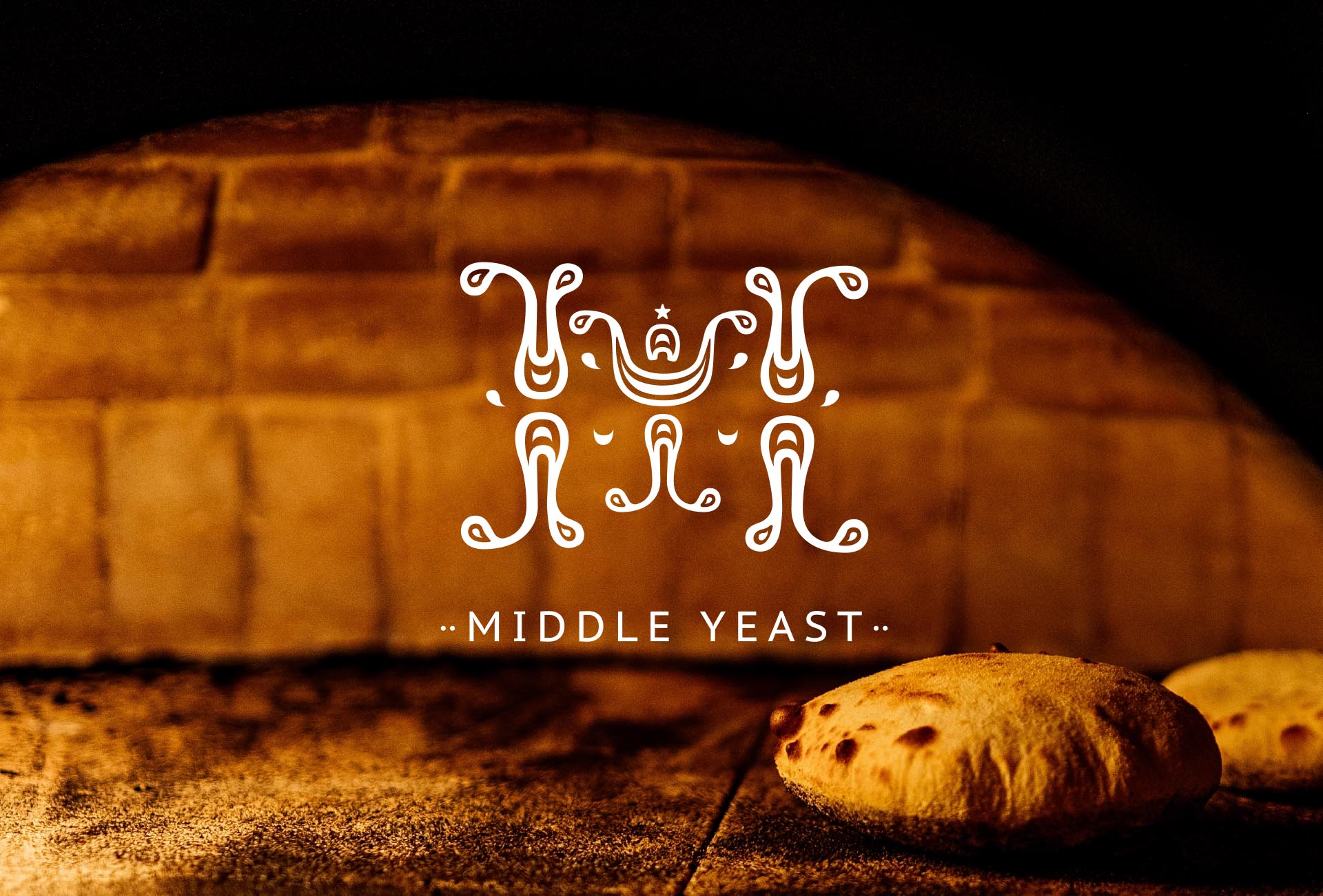
The logo needed to be iconic and easily recognisable, yet flexible enough to adapt across digital and physical spaces. KianDesignCo developed a logo that merges the Middle Eastern sun symbol with a stylised wheat pattern—a nod to the staple grains and bread that form the foundation of Middle Eastern cuisine. The font choice was a modern, sans-serif typeface that complemented the logo’s bold design, making it legible and impactful.
The chosen colour palette reflects the natural beauty of Middle Eastern landscapes, from desert sands to lush oases. Warm, earthy tones were balanced with rich, vibrant accents, giving the brand a distinct look that feels both exotic and inviting. The typography was selected to provide contrast, with clean, modern fonts for a contemporary feel. Accent typography featured subtle, culturally inspired decorative elements, bringing a touch of Middle Eastern artistry without being overly ornate.
For Middle Yeast’s bakery and cafe products, KianDesignCo designed packaging that would feel cohesive across different offerings, from baked goods to coffee. Patterns inspired by traditional Middle Eastern tile-work were subtly integrated on packaging and coffee cups, making each item feel like a piece of art. For the interiors, KianDesignCo recommended textures and materials that reinforce the brand’s warmth and authenticity, including terracotta pots, patterned tile accents, and rustic wood finishes.
As a new franchise, Middle Yeast needed a strong online presence to engage customers and build loyalty. KianDesignCo developed a website and social media templates that communicate the brand’s story and offerings clearly. The website layout is clean and user-friendly, with easy navigation for menu items, store locations, and franchise information. Each page features a mix of photography and graphic elements that echo the brand’s colours and patterns, creating a visually cohesive experience that reflects the in-store ambiance.
The branding for Middle Yeast by KianDesignCo has been a resounding success, creating a strong visual identity that captures the essence of Middle Eastern hospitality in a modern framework. Customers are instantly drawn to the inviting colours, authentic patterns, and approachable vibe that make Middle Yeast feel both trendy and timeless. The brand’s consistency across all touch-points—from in-store signage to social media—has helped build a loyal customer base and allowed Middle Yeast to stand out in the competitive bakery and cafe market.
Middle Yeast’s founders were thrilled with the results. They shared, “KianDesignCo has brought our vision to life in a way we couldn’t have imagined. The brand feels like an authentic extension of our culture but speaks to a global audience in a modern way. We’re excited to expand with this powerful branding foundation.”
Through deep cultural insight, creativity, and a keen eye for modern design, KianDesignCo has successfully transformed Middle Yeast into more than just a bakery and cafe. It’s now a brand that tells a story of heritage and warmth, wrapped in a contemporary, inviting package. As Middle Yeast grows into a franchise, its identity and brand consistency will play a crucial role in its success, resonating with customers across diverse backgrounds.
KianDesignCo’s collaboration with Middle Yeast is a perfect example of how thoughtful design can bridge cultures, build strong customer connections, and set the stage for business growth. With a brand identity that’s both culturally respectful and universally appealing, Middle Yeast is well on its way to becoming a beloved name in the food and hospitality industry.