Identity Design
Crafting a Strong Identity: Kiandesignco’s Logo Design for Sydney EP
In a bustling city like Sydney, where health and fitness are paramount, a new startup called Sydney EP is emerging as a vital player in the realm of exercise physiology. To establish a memorable brand identity and communicate its core values, Sydney EP partnered with Kiandesignco for a comprehensive logo design. This blog post explores the creative journey behind the logo and how it reflects the essence of Sydney EP.
The journey began with a deep understanding of Sydney EP’s mission: to provide personalized exercise physiology services that empower individuals to achieve their health and fitness goals. The team at Kiandesignco engaged closely with the founders to grasp their vision, target audience, and the unique approach they bring to exercise physiology. This foundational knowledge was crucial in crafting a logo that truly embodies the brand’s ethos.
With a clear understanding of the brand, Kiandesignco set out to conceptualize a logo that reflects Sydney EP’s commitment to health, movement, and community. The design process involved brainstorming sessions, sketching ideas, and refining concepts that would resonate with the target audience. The goal was to create a logo that not only looks appealing but also communicates the values of professionalism, support, and expertise.
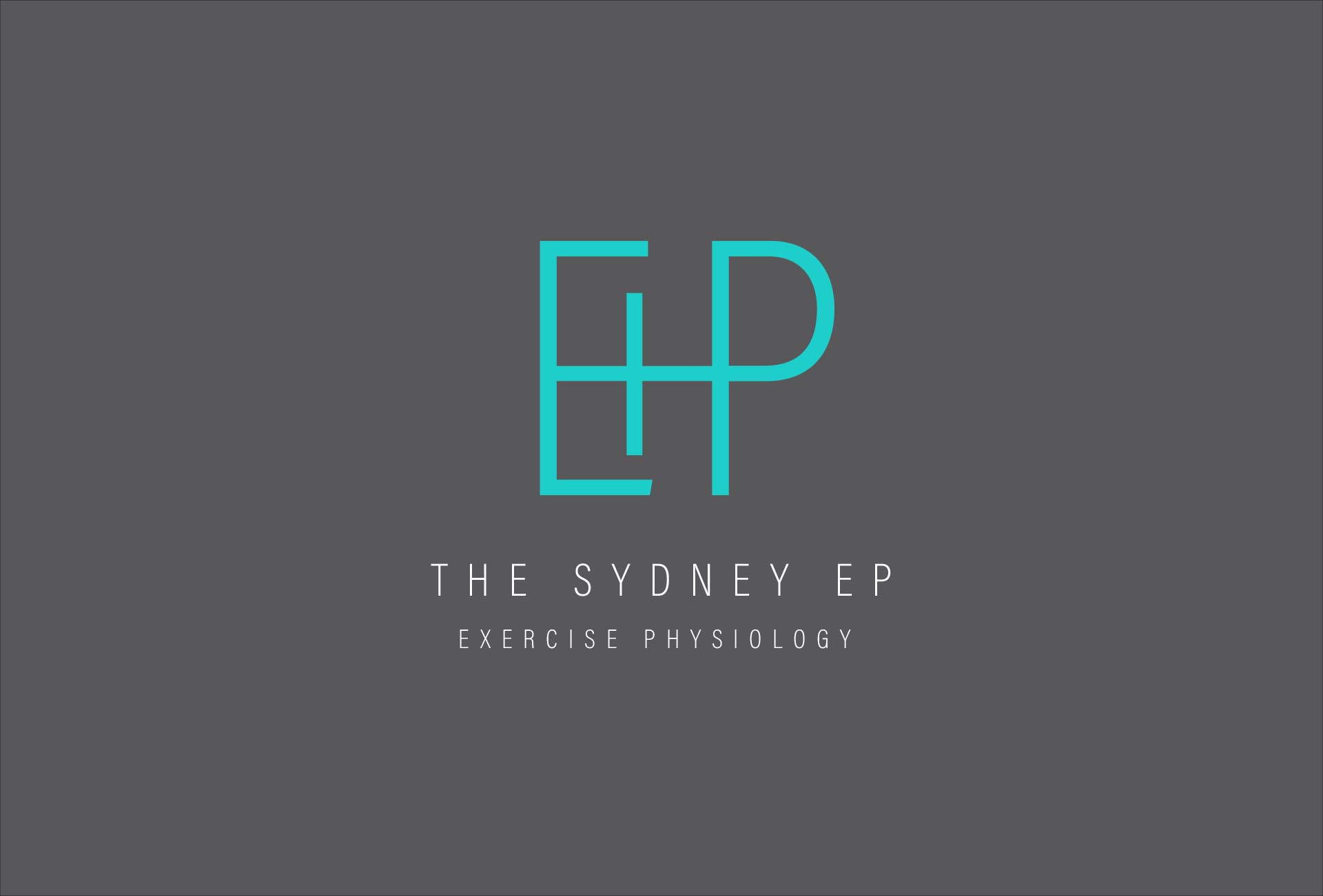
The final logo design is a perfect blend of modernity and dynamism. Kiandesignco opted for sleek, contemporary typography that conveys professionalism while remaining approachable. The use of vibrant colors symbolizes energy and vitality, essential elements in the field of exercise physiology. Additionally, subtle graphic elements represent movement, reinforcing the core mission of helping clients achieve their fitness goals.
One of the key considerations in the logo design was versatility. Kiandesignco ensured that the logo would work across various applications, from business cards and stationery to digital platforms and signage. This flexibility allows Sydney EP to maintain brand consistency, which is vital for building recognition and trust in the competitive health and fitness market.
The new logo serves as the cornerstone of Sydney EP’s branding strategy. With a strong visual identity in place, the startup is well-equipped to build brand awareness through marketing materials and social media campaigns. Kiandesignco collaborated with Sydney EP to develop a suite of collateral that complements the logo, including brochures, flyers, and social media graphics, all designed to convey the brand’s message effectively.
As Sydney EP aims to foster a sense of community among its clients, the logo plays a crucial role in creating a welcoming atmosphere. The friendly design invites individuals to engage with the brand, making them feel supported on their fitness journeys. This connection is essential for building lasting relationships and establishing Sydney EP as a trusted partner in health and wellness.
The collaboration between Sydney EP and Kiandesignco marks the beginning of an exciting journey. With a strong logo that captures the essence of the brand, Sydney EP is poised for growth and success in the competitive field of exercise physiology.
Visit SEP for more.